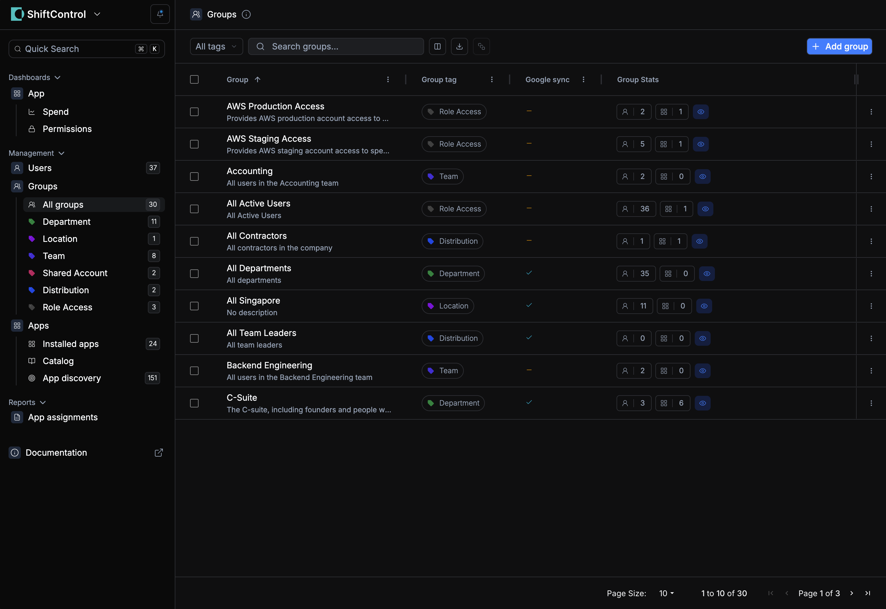
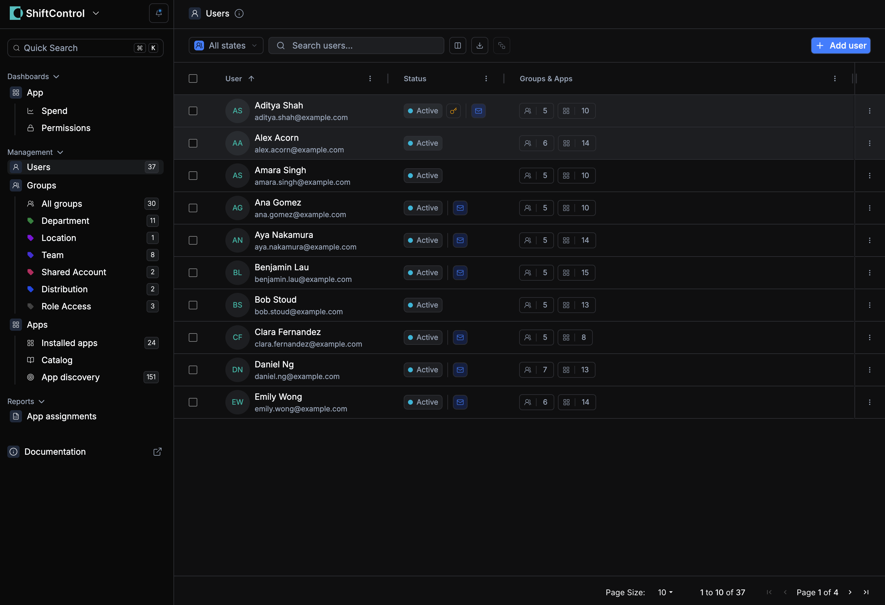
We’ve rolled out an update to our color themes to make ShiftControl easier and more comfortable to use across the board.
You’ll notice improved contrast and clearer visual hierarchy, making important elements stand out more at a glance 👀. We’ve introduced a subtle three-tone background across the left, middle, and right panes to better visually separate sections and reduce cognitive load while navigating.
Both light mode and dark mode have been refined 🌗. We’ve updated form fields, popovers, cards, and modals to ensure they’re easier to see and sit cleanly against their backgrounds. Border colors have also been improved so boundaries are more visible without feeling heavy or distracting.
Overall, this update is about clarity, accessibility, and reducing friction as you move through the app. As always, more refinements are on the way 💚

